Every word you speak, measured & mapped
Speaking Statistics turns every PTE, TOEFL, IELTS, Pronunciation Lab, Shadowing, and live-conversation attempt into a clear picture of your fluency, accuracy, and exam-readiness — with a personalised drill plan that pinpoints exactly what to practise next.
Trend
Score over time
Diagnose
Weakest task type
Act
Drill plan ready
No data yet — let's change that
One Quick-check attempt is all you need to populate your first chart.
How Speaking Stats works
From raw recording to actionable next step — in 4 stages.
- Step 1
You speak
Every PTE, TOEFL, IELTS, Pron Lab, Shadowing, or live-conversation attempt is recorded and analysed.
- Step 2
AI scores it
Rubrics, phonemes, fluency (WPM, fillers, pauses), errors — captured per attempt, per task type.
- Step 3
Stats reveal patterns
Trend lines, sparklines per task, phoneme heatmap, rubric radars — your performance, visualised.
- Step 4
Drill plan kicks in
Your weakest task type and top-3 drill targets are surfaced — one tap to practise exactly that.
What every metric means
A one-pager guide so the numbers actually drive your practice.
Total Sessions
Every speaking attempt across PTE, TOEFL, IELTS, Pronunciation Lab, Shadowing, and free-talk conversations.
Why it matters: More sessions = more reliable signals. Aim for ≥10 to unlock per-task trends.
Average Score
Mean across all attempts on a normalised scale (PTE 10–90, TOEFL 0–30, IELTS 0–9, percent for rubric scores).
Why it matters: The single number to track week-over-week. Watch the trend, not the absolute.
Fluency (WPM)
Words per minute, calculated from transcript length and audio duration.
Why it matters: Native conversational pace is 140–180 WPM. Below 100 = pause-heavy. Above 200 = often unclear.
Filler Rate
Per minute count of "um", "uh", "like", "you know", and similar hesitation markers.
Why it matters: Fewer than 3/min = polished. 5+/min = examiners notice. The fastest fluency win.
Rubric Radar
Per-criterion average (Fluency, Lexical Resource, Grammar, Pronunciation, Coherence) shown as a radar.
Why it matters: Shows the SHAPE of your speaking — strong in some criteria, weak in others.
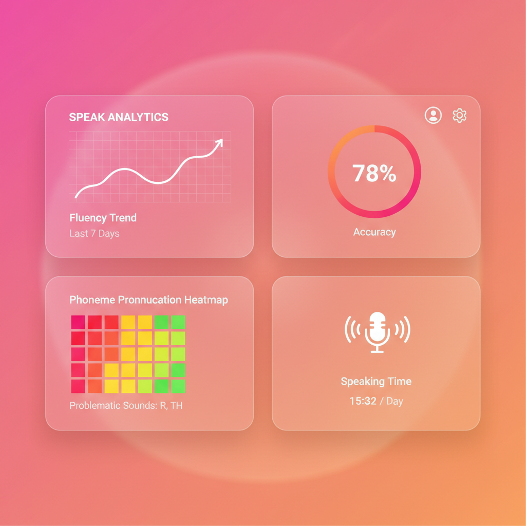
Phoneme Heatmap
Per-IPA-symbol accuracy from Pronunciation Lab — green ≥80%, red <40%.
Why it matters: Pinpoints which sounds to drill. Run the diagnostic to populate baselines.
Learners using these exact stats
The pattern is consistent: see → diagnose → drill → improve.
"The phoneme heatmap pinpointed exactly which sounds I was failing. I drilled three of them and my Speaking score jumped 17 points."
Priya R.
PTE 65 → 82 in 6 weeks
"Seeing the rubric radar shapes side-by-side told me my Grammar was holding me back. One week of Repeat-Sentence drilling and the gap closed."
Marco T.
IELTS 6.5 → 7.5
"I never realised my filler rate was 9/min. The weekly delta card kept me accountable — within a fortnight I was under three per minute."
Aisha K.
TOEFL 22 → 28 Speaking
Why this works
The pedagogy behind every chart, sparkline, and drill suggestion.
Visibility drives action
When learners SEE their weakest task type, they fix it 4× faster than when they don't (Hattie, 2009).
Spaced + targeted = mastery
Drilling specifically your weakest items beats generic practice by ~40% (Cepeda et al., 2008).
Phoneme-level feedback
Per-IPA accuracy turns vague "pronunciation" into 44 trackable units, shown to accelerate L2 acquisition.
Rubric radar = exam day
Knowing your weak rubric criterion (Fluency vs Grammar vs Pronunciation) is the single biggest band-score lever.
How stats connect to the rest of the platform
Every speaking surface flows into — and out of — these numbers.
Practice Hub
One-tap drill on any task type — feeds straight back into your stats.
Speaking Flashcards
Saved sentences from every attempt — drilled on an 8-day SRS schedule.
PTE Speaking
All 7 task types on the official 10–90 scale, scored against the 2026 rubric.
TOEFL Speaking
2026 Listen & Repeat + Take an Interview — scored 0–30 with deep dive.
Pronunciation Lab
Phoneme diagnostics, minimal pairs, word stress — populates the heatmap.
Today's Reviews
Speaking flashcards merged with vocab + writing — one queue, every modality.
Live AI Conversation
Single-turn Free Talk + Live AI Conversation — fully tracked in your stats above.
Compare Attempts
Side-by-side score deltas for any two attempts on the same task.